
The Making of The Modern Art of Color for Brand Events
We host our loyal event planner friends once a year with an interactive, educational event. Inspired by our venue this year, Laguna Gloria—a historic venue that sits on a sculpture garden—we invited event vendors to give mini presentations about the art of using color to tell stories, set moods, and bring ideas to life in their respective crafts.
While designing the events decor, we knew we wanted to highlight each vendors brand by creating individual vignettes using three things: color, cool backdrops, and intentional rental choices. We also wanted these vignettes to double as photo ops so they needed to look really amazing!
Follow along.. you could use this same design process to highlight vendors at a brand pop-up, market, or other brand events!
Highlighting Brand Colors For Brand Events
Our event color palette was inspired by the five vendors who presented. For each vendor, we pulled a color that reflected their brand identity or that would pair well with a color used in their branding. We were designing for a small space so we kept in mind that all of the colors had to work well alongside each other while being different enough to highlight each individual brand.
For example, Sage & Sea Ink’s main brand color is obviously.. sage! We decided to push the envelope (for our stationery vendor 😉) and use lime green as the main color for her vignette. While sage and lime might seem like a tricky pairing, using them together was a great example of how varying shades can work well in monochromatic palettes.
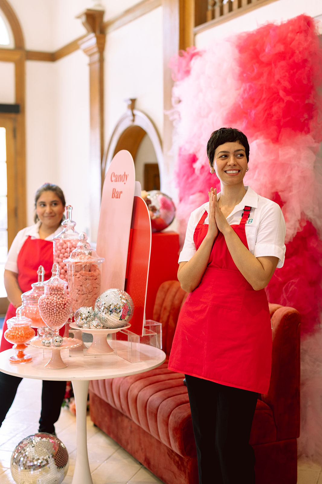
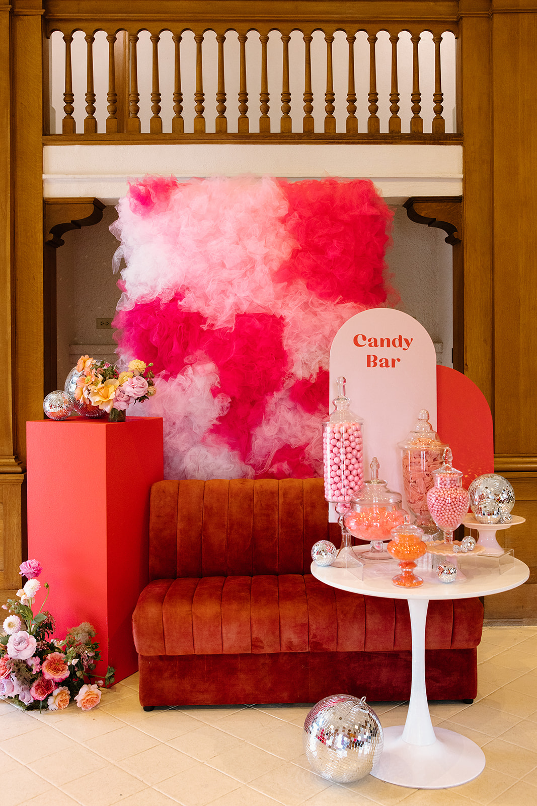
We pulled the pink from The Cupcake Bar’s branding and used multiple shades of pink tulle to create a textured backdrop that reflected the fun, bright energy of their brand.
As you moved through the space, you could feel the difference in each vendor’s brand reflected in the colors alone!
Custom Backdrop Designs
For each vendor, we designed a backdrop that would help highlight their services or brand. We knew our tabletop vendor, Table Manners, would want to show off their physical product. As shown below, we added chunky shelves to an orange backdrop wall for displaying glassware.
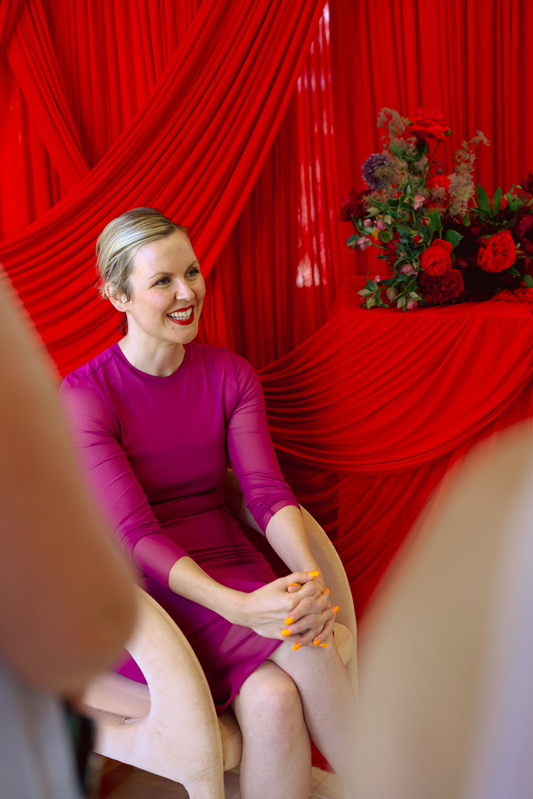
For our floral vendor Margot Blair, we created a romantic, draped red backdrop to present their luxe, colorful brand to attendees. Draping the fabric over pillars provided the perfect space to place dramatic, red floral arrangements.

Intentional Rental Choices
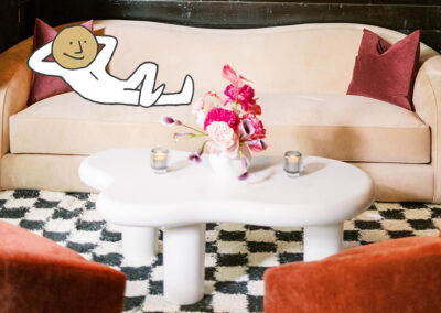
Considering form and function is important when you want a booth that not only looks good, but serves its purpose. Because these vignettes doubled as photo ops, each one had a matching sofa or lounge chair. Along with the lounge furniture, we needed our vendors to be able to display products and give demonstrations, so we carefully selected bistro tables, pedestals and side tables that looked great alongside the lounge pieces.
When considering how to display products, don’t limit yourself to shelving! Pedestals and tables make great displays and we’re always for repurposing rentals in new ways. Our custom color items, like these pedestals, can be personalized with a brands colors and vinyl logos to make your design feel even more intentional.

Highlighting multiple brands in one space while keeping the overall look of your event cohesive can be a challenge, but don’t be afraid to use color! A smart and intentional use of color can highlight areas of your space and showcase different brand identities. Scroll through this gallery to see how we represented five different brands in one venue!
Photo Gallery
- All

Moontower Event: The Modern Art of Color

Moontower Event: The Modern Art of Color

Moontower Event: The Modern Art of Color

Moontower Event: The Modern Art of Color

Moontower Event: The Modern Art of Color

Moontower Event: The Modern Art of Color

Moontower Event: The Modern Art of Color

Moontower Event: The Modern Art of Color

Moontower Event: The Modern Art of Color

Moontower Event: The Modern Art of Color

Moontower Event: The Modern Art of Color

Moontower Event: The Modern Art of Color

Moontower Event: The Modern Art of Color

Moontower Event: The Modern Art of Color

Moontower Event: The Modern Art of Color

Moontower Event: The Modern Art of Color

Moontower Event: The Modern Art of Color

Moontower Event: The Modern Art of Color

Moontower Event: The Modern Art of Color
Partners in Party:
Venue- Laguna Gloria
Dessert & Gifting- The Cupcake Bar
Tabletop Rentals- Table Manners
Florals- Margot Blair
Stationery- Sage & Sea Ink
Headshots- TX Foto Events
Headshots- Nowadays Film
Headshots & Event Photography- Mackenzie Smith Photography